
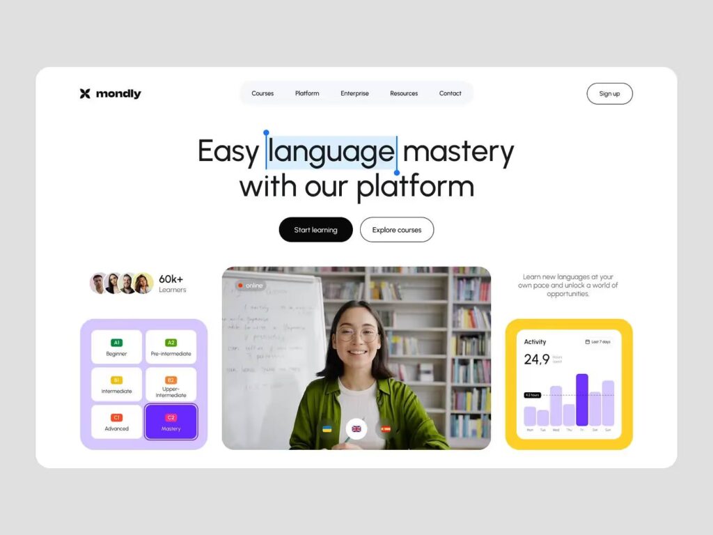
Your website’s first screen isn’t just design. It’s strategy.
The hero section is the face of your product. In just a couple of seconds, visitors decide whether they trust you and want to explore further.
So how do you make that screen work for you—not against you?
We recently gathered 10 key principles that help turn first screens into conversion machines:
Start with the user, not the company. Visitors want to see how you solve their problem — not how great your company is.
Design for goals, not for awards. Clean, distraction-free design serves a purpose: helping people achieve what they came for.
Visual hierarchy drives attention. Guide the user’s eye using dominant elements, spacing, and typographic structure. Make the next step obvious.
Use strong visuals with clear intent. Hero images should reinforce your message. One screen — one idea.
Motivate through emotion. Emotional triggers (confidence, curiosity, fear of loss) often work better than generic benefits.
Add real or implied benefits. Show not just the product, but the transformation it enables.
Respect their mental load. Simple navigation, clear structure, and generous white space are not optional.
Craft a sharp headline. Make it short, punchy, and centered around the user’s gain.
Test what works. Blurred mockups. Eye-tracking tools. Click maps. These tell you what people actually notice.
Don’t rely on your CTA alone. A button never convinces anyone — but a compelling message can.
Designing a good first screen is never just about aesthetics — it’s about aligning your visuals with user psychology, business goals, and product value.
If you’re working on a new homepage or rethinking your product’s entry point, we’d be happy to share our approach.
#UXDesign #WebDesign #ProductDesign #LandingPage #UIUX #DesignStrategy #ConversionOptimization #SaaS #StartupTips #UserExperience