About the project
MedNote is a mobile app designed to help users organize and manage their personal health information — including doctor visits, test results, diagnoses, and treatment plans — all in one secure and accessible place.
The primary challenge of this mHealth application was not just to create a visually clean app, but to design an experience that would reduce cognitive load and make complex health data feel simple, personal, and safe. The product targets a broad audience — from tech-savvy individuals to elderly users and caregivers — which meant that clarity and empathy had to be at the core of every decision.
UX Research and Discovery
We began the project with in-depth UX research:
Conducted interviews with patients, parents, and caregivers managing health records for others
Spoke with medical professionals to understand how people recall and store medical data
Analyzed competitors from the health, wellness, and insurance sectors to identify gaps in clarity, empathy, and usability
One key insight shaped the product direction: users don’t think in categories like “diagnoses” or “services” — they remember episodes of care. This led to the core concept of grouping entries into personal medical cases.
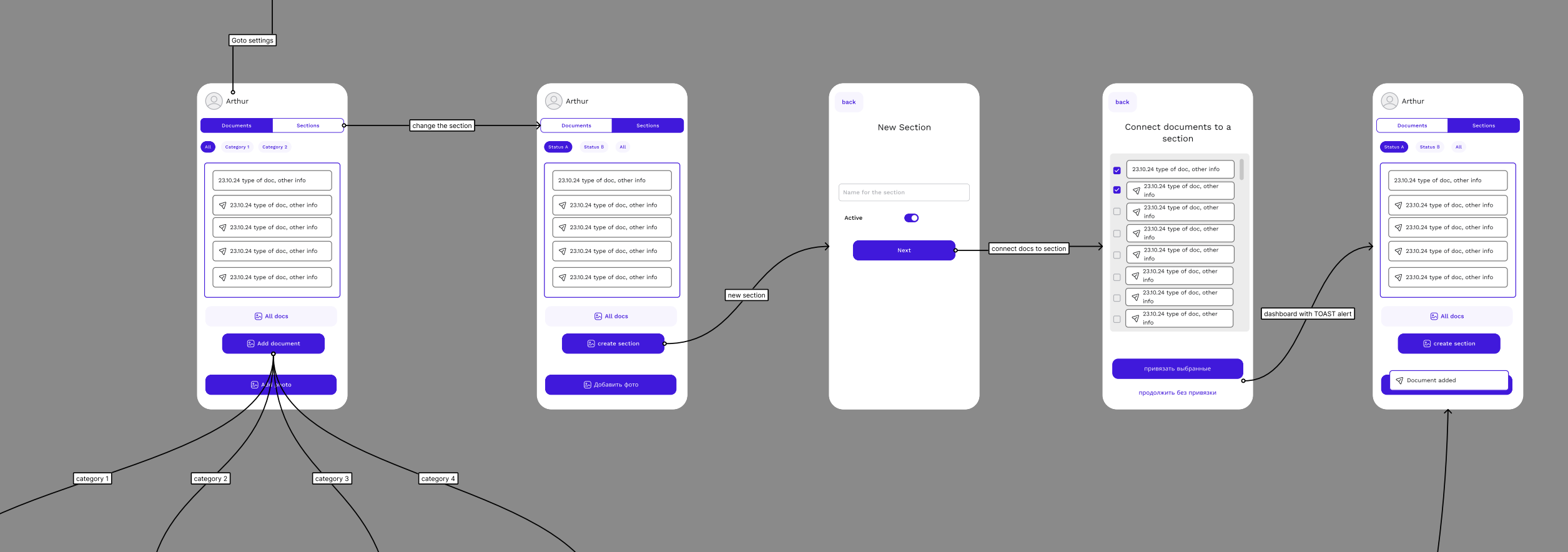
UX DESIGN PRINCIPLES
The entire experience was built around:
Progressive input: Each interaction is minimal and focused, allowing data to be added step by step
Mental clarity: Timeline-based structure and smart grouping reduce overwhelm
Emotional safety: Soft tone, non-clinical visuals, and frictionless navigation support a positive user experience
Multi-profile structure: Users can manage health records for themselves or family members
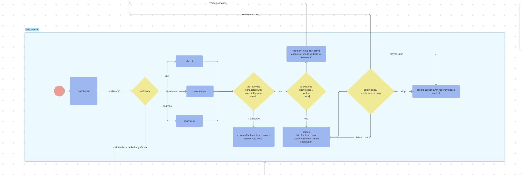
User flows, wireframes, and full interaction maps were created to support scenarios like:
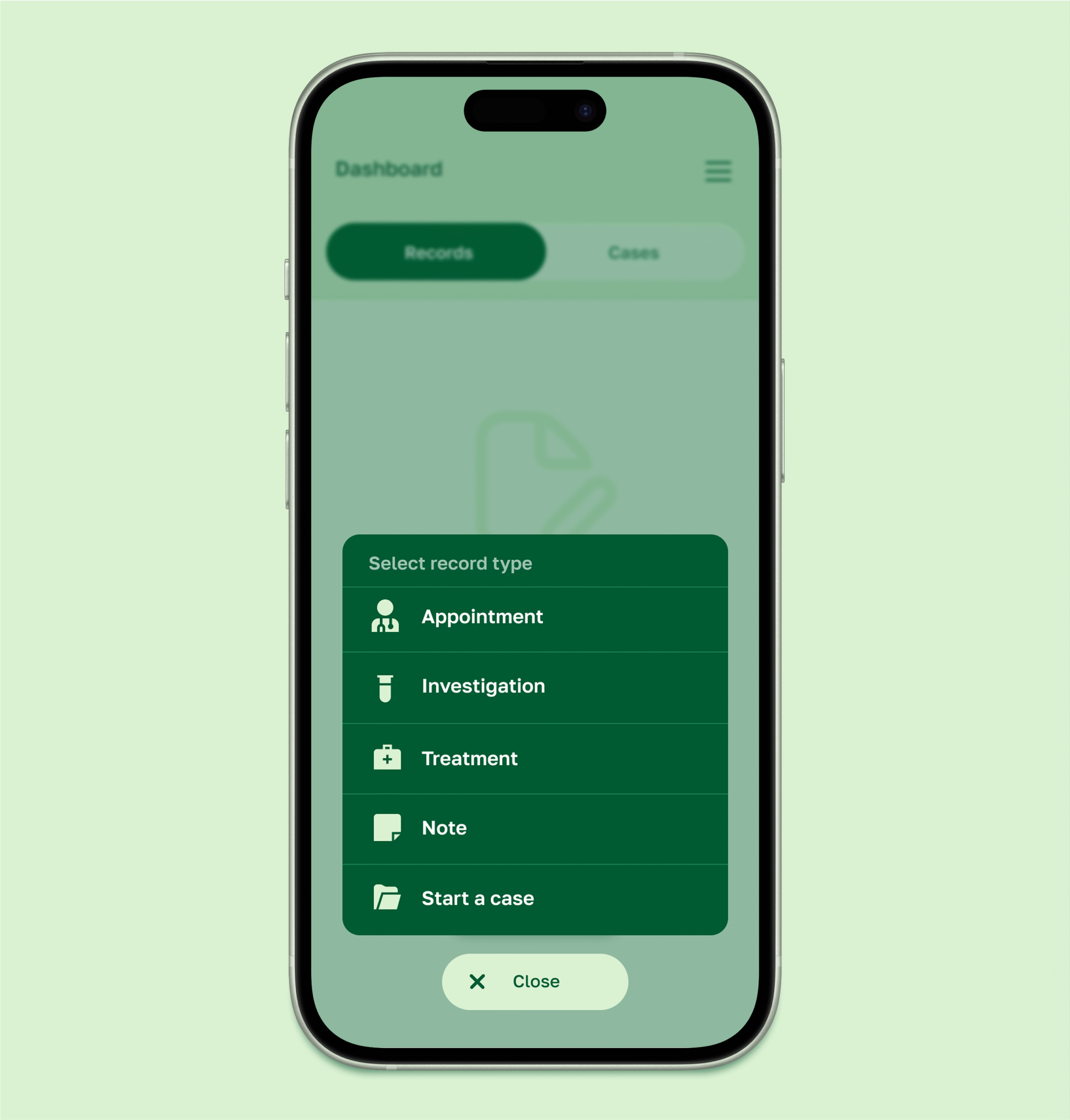
Adding a doctor visit or conclusion
Uploading a lab result
Linking documents into a shared case
Viewing historical health data across time
Interface & Visual Concept
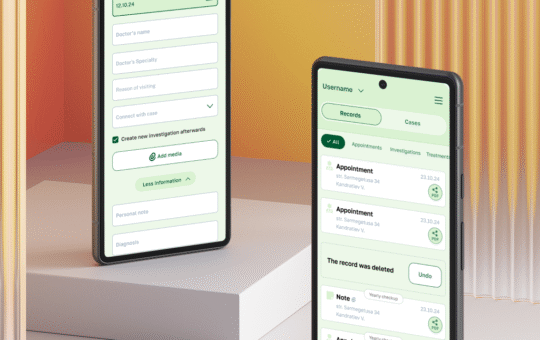
The interface is built around card-based lists that visually mimic structured medical tables — offering the clarity of a spreadsheet with the warmth of a mobile app. This approach makes browsing, scanning, and editing health data feel easy and natural.
Special attention was given to:
Onboarding and empty states
Scan-and-attach functionality
Reusable UI patterns with minimal cognitive load
Visual consistency across dark and light modes
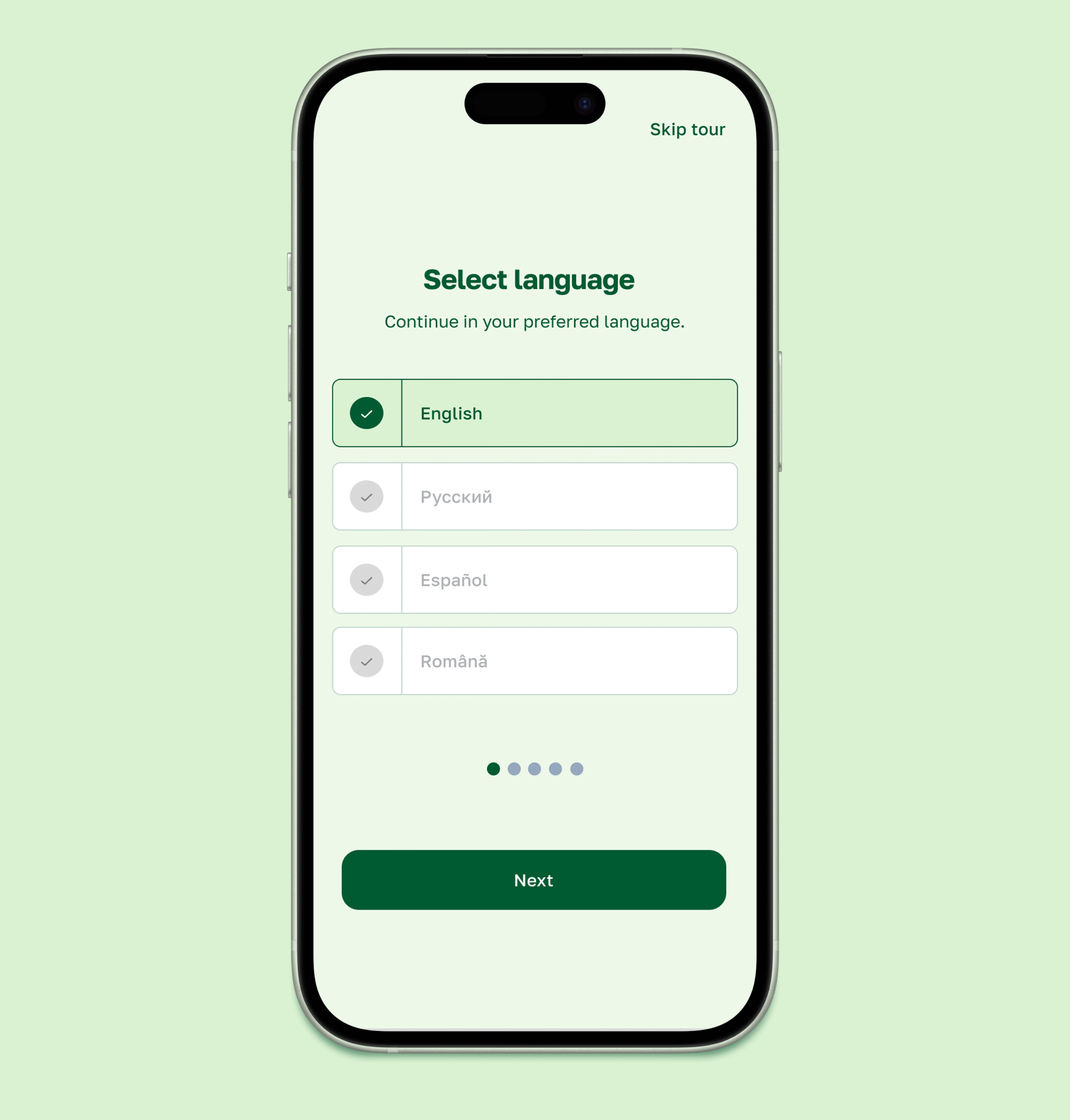
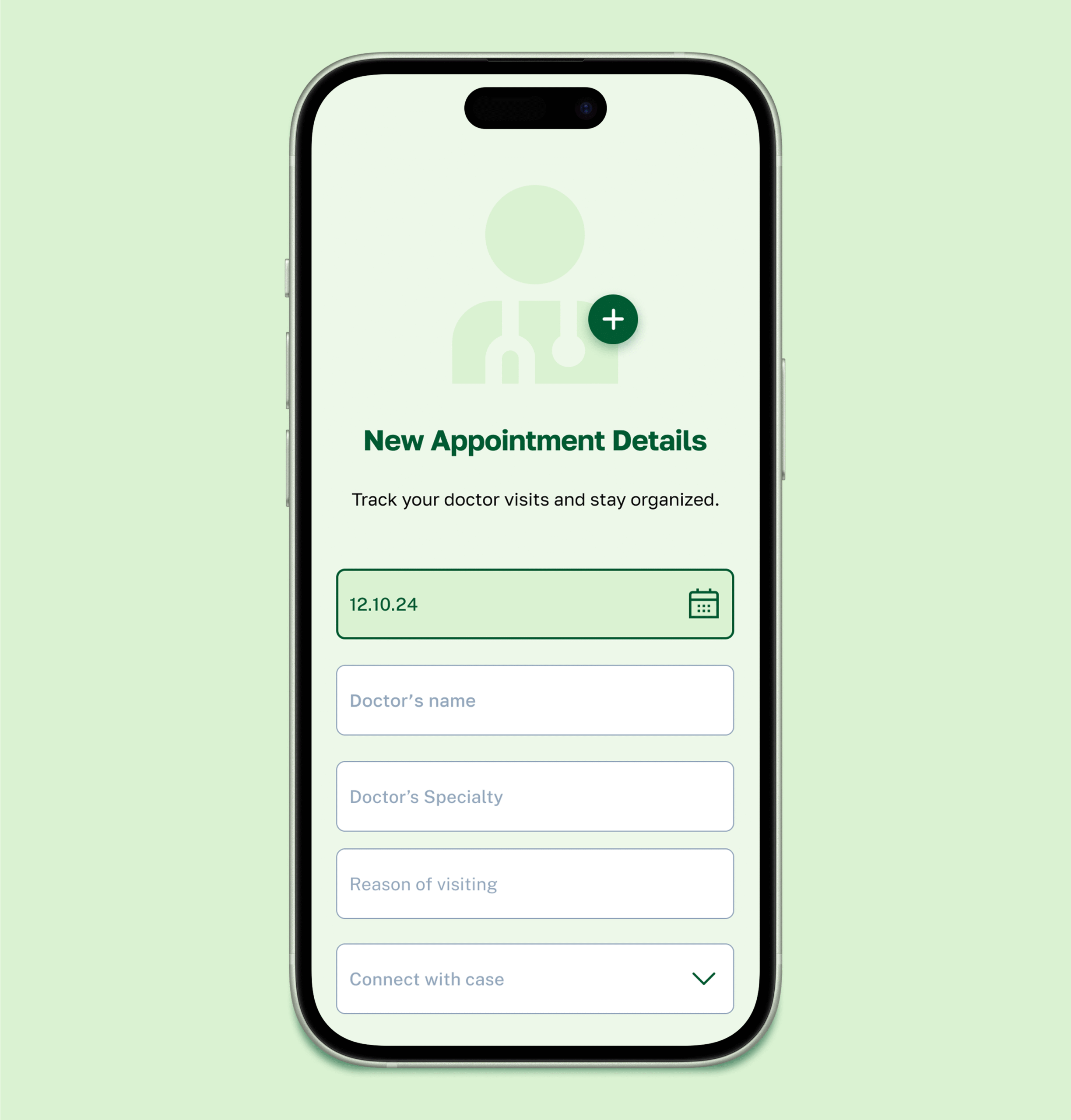
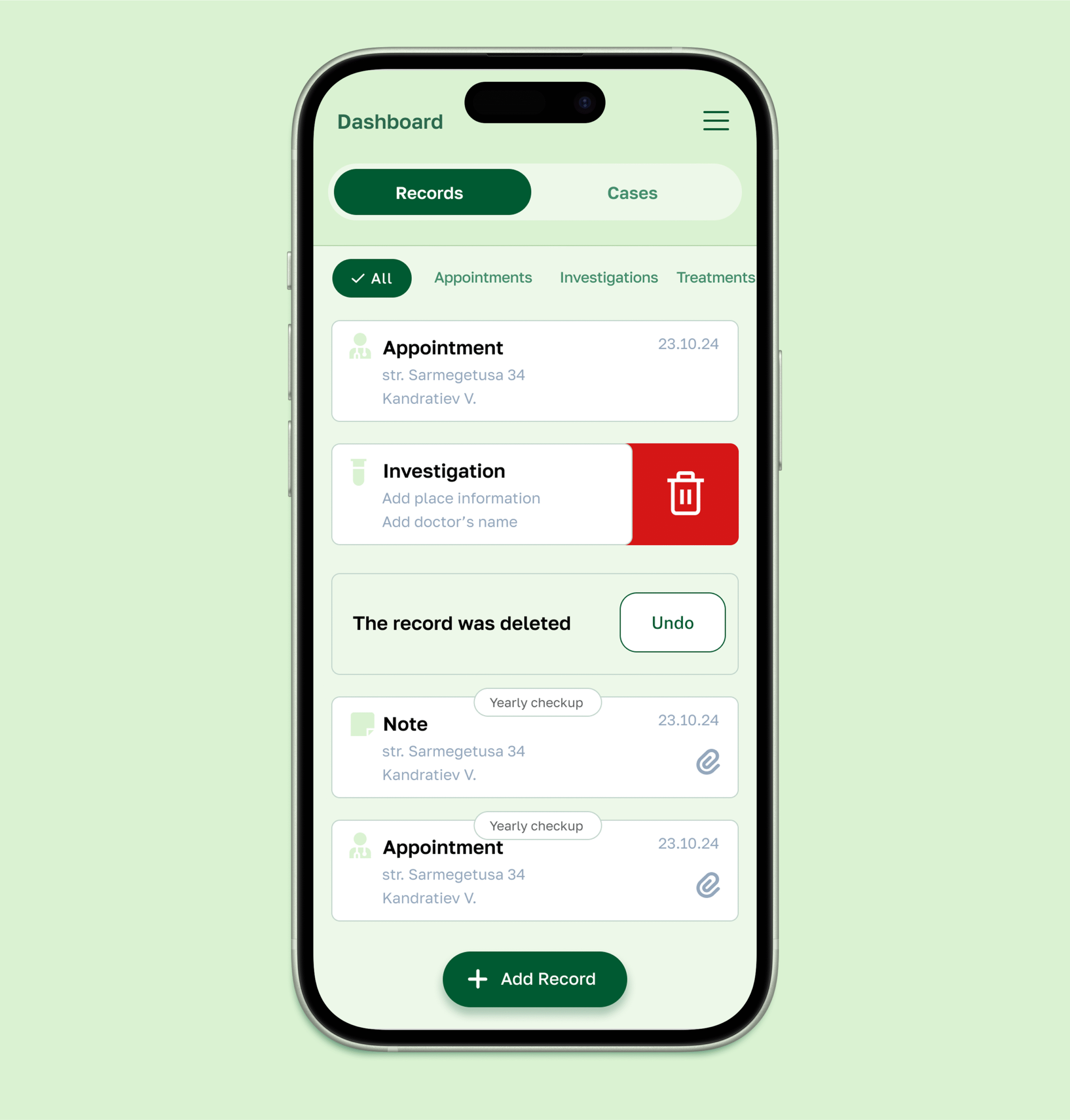
Development
The mobile app was fully developed by my team using Flutter, allowing us to launch a smooth, fast cross-platform product for both iOS and Android. Tight collaboration between design and development ensured high fidelity to the original UI and optimized delivery time.
