About the project
POD is a web-based platform developed by Axseed to help project-driven organizations visualize and manage complex datasets — including budgets, timelines, resource allocation, and project risks. The tool is designed for project managers, analysts, and executive stakeholders who need to turn raw, often messy data into clear dashboards and action points.
We were responsible for designing the platform’s UX/UI from the ground up — from import wizards and dashboards to visual logic, component systems, and mobile responsiveness.
The challenge
The platform had to support three distinct but interconnected workflows:
- Importing and mapping complex data sources
- Creating dashboards using modular visualizations
- Sharing project insights with internal and external teams
The primary UX challenge was creating an interface that could scale from basic use (e.g. uploading a budget file) to advanced use (e.g. customizing Gantt charts and KPI snapshots) — while remaining accessible to non-technical users.
Research & UX Strategy
We worked closely with PMOs and project coordinators to understand their real-world workflows:
How they currently build reports (Excel, PowerPoint, Word)
Where they lose time or make errors (column mapping, data cleaning)
What types of graphs and insights matter most for decision-making
Based on interviews and research sessions, I mapped out core user flows and interaction patterns — with a special focus on error prevention, guidance, and visual clarity.
Key UX Solutions
- Data Import Wizard
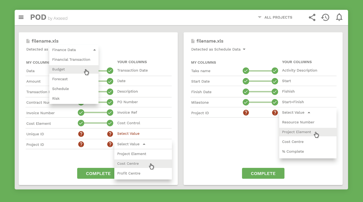
Uploading raw XLS or CSV data is a high-friction task, often filled with mismatched headers or missing values. I designed a two-column “matching” interface where users could:
See auto-detected column suggestions
Manually assign unmapped fields via dropdowns
Get real-time feedback using color-coded status icons
Complete partial imports with fallback logic
This allowed even first-time users to successfully ingest datasets with minimal friction.
Key UX Solutions
2. Widget-Based Dashboard System
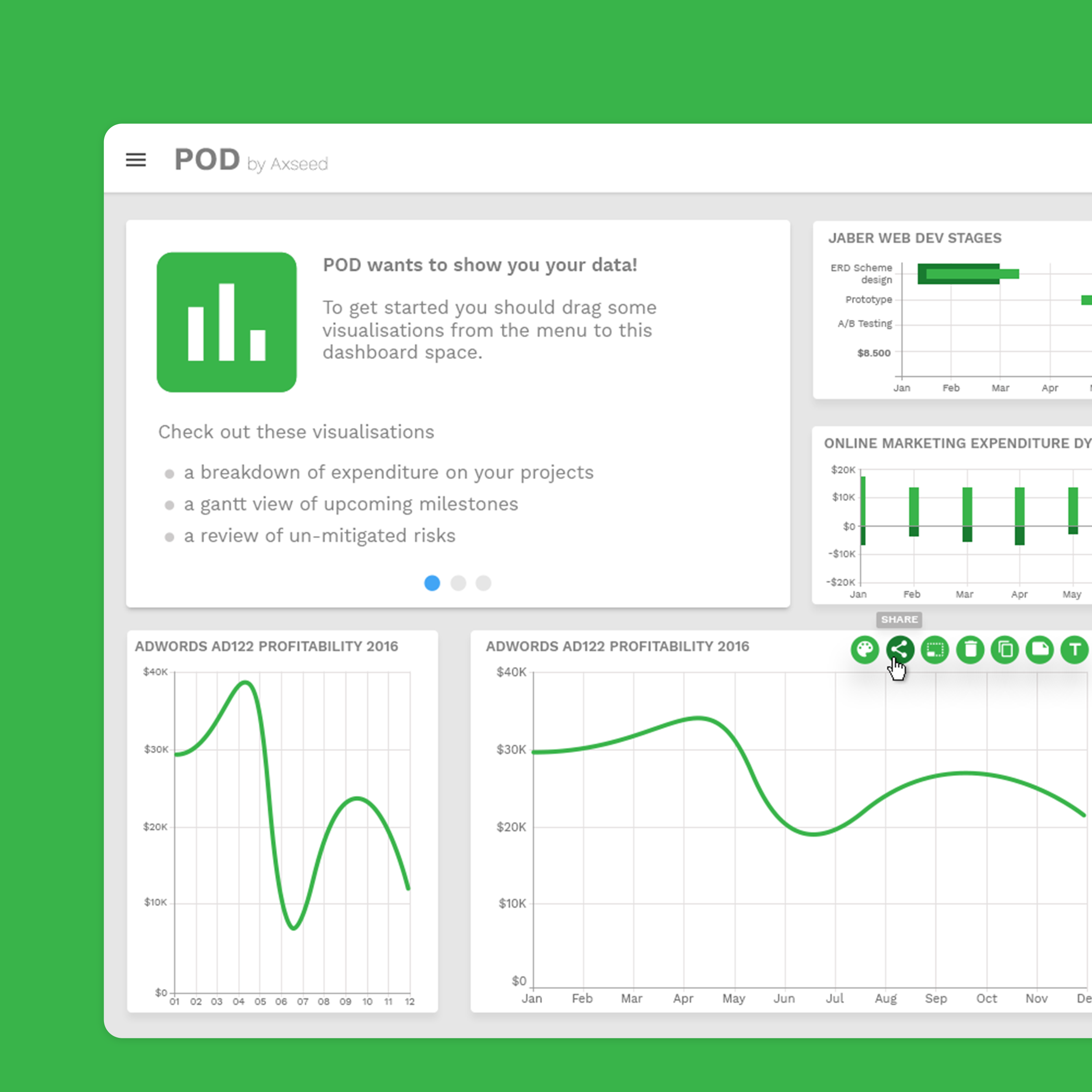
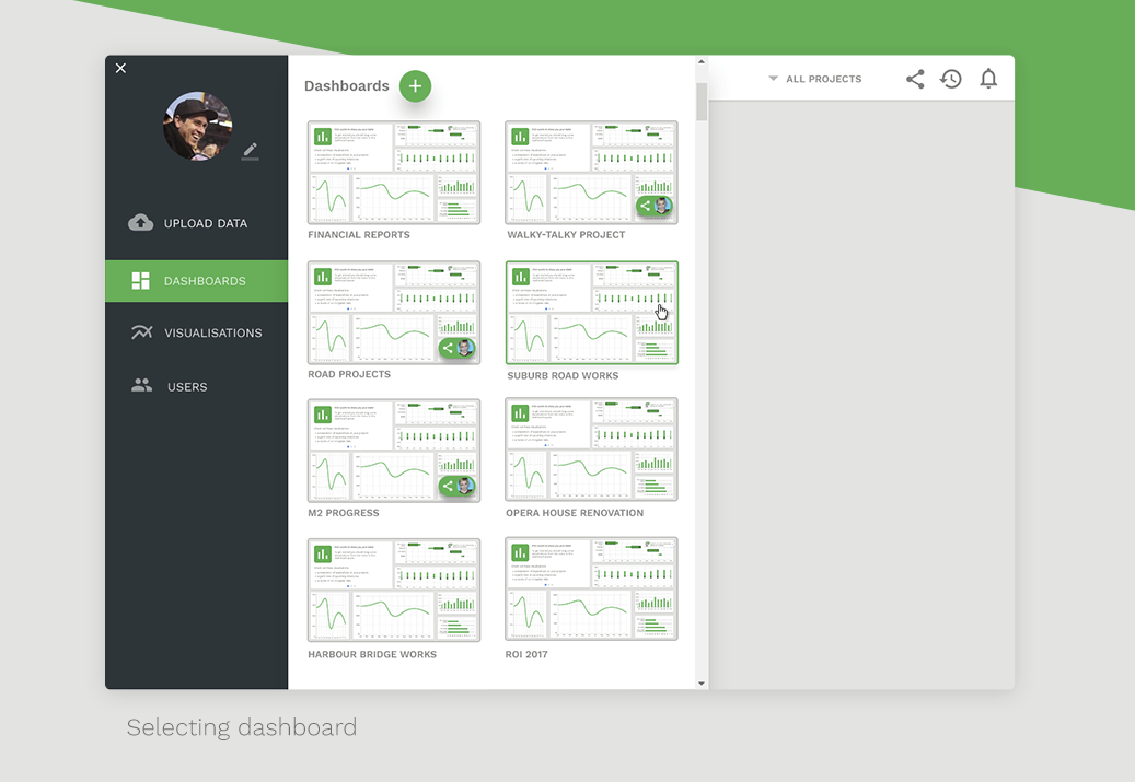
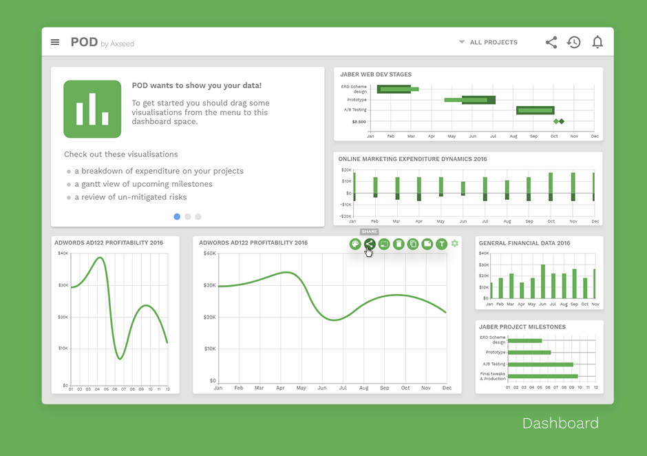
Users can build their own dashboards by dragging and configuring visual components. Each widget is editable, resizable, and movable — providing full flexibility without breaking layout integrity.
All visualization types were designed with scalability and clarity in mind. Key components include:
Progress rings (% completion)
Donut and radial charts (risk & status)
Gantt charts (milestone and task planning)
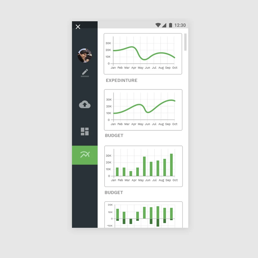
Line graphs (trends over time)
Risk matrices (likelihood × impact)
Annotated timelines (project events with labels)
Each graph supports customization (e.g. time scale, color, labels) via a dedicated options panel.
3. Mobile & Responsive Design
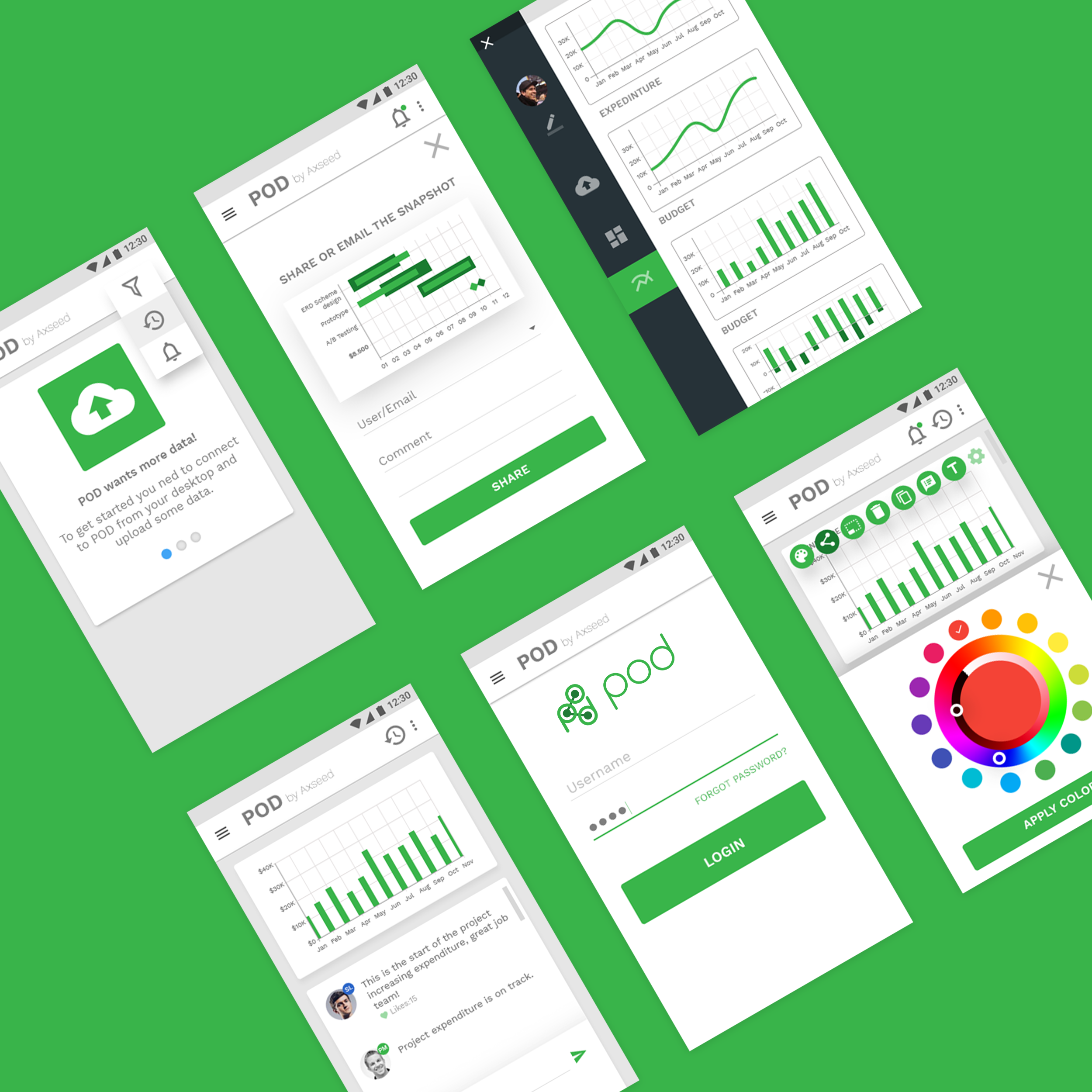
Although the platform was primarily desktop-oriented, I adapted core views for tablet and mobile environments. A collapsible side menu and condensed preview graphs allowed users to monitor data on the go, especially for quick status checks and stakeholder reviews.
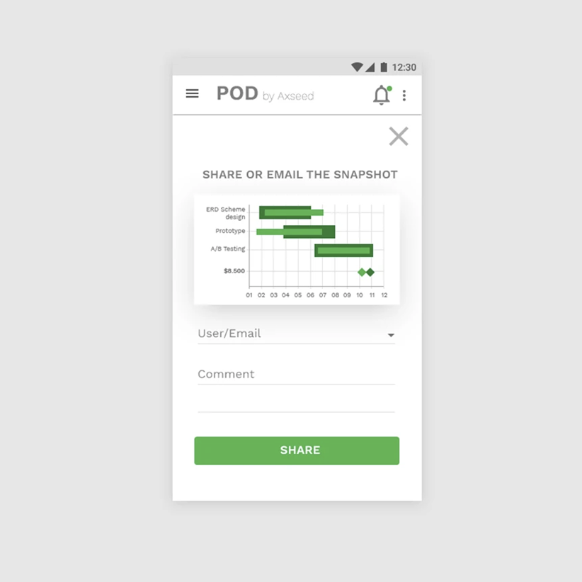
4. Snapshot Sharing
Each graph and dashboard can be shared via email or exported as a visual snapshot. This feature is essential for cross-team collaboration and weekly/monthly report cycles.
The sharing flow supports:
Inline commenting
Email-based delivery
PDF-ready snapshots
Visual System
Typography: Work Sans — selected for clarity and modern tone
Color Scheme: Neutral base with green for status and action, used consistently across graphs and UI states
Icon System: Scalable Material Design icons for universal recognition
Component System: Modular, reusable graph blocks built for scale
