About the project
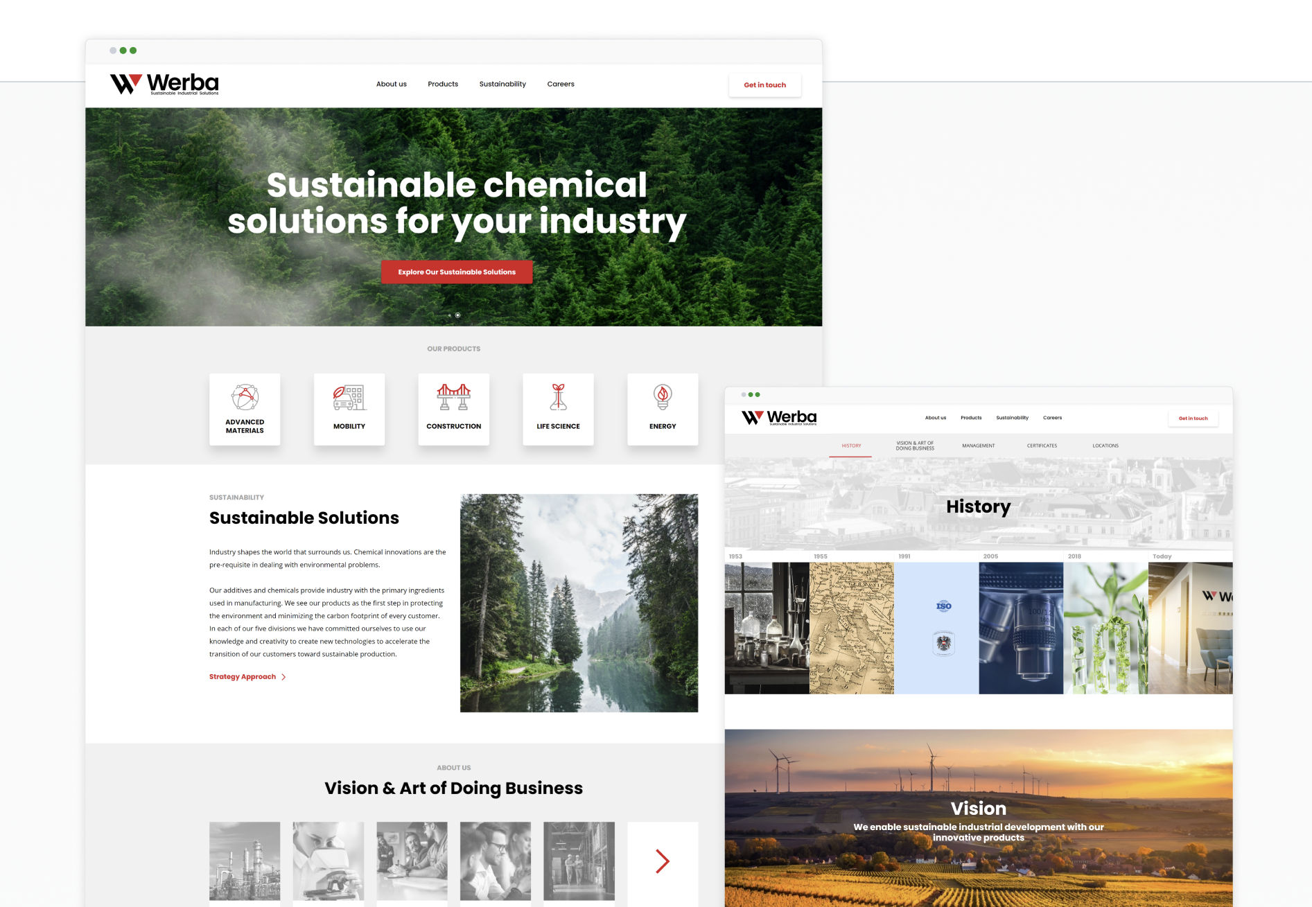
Werba Chem is a specialty chemical supplier committed to sustainable industrial development. We were invited to create their first digital presence and redefine the brand’s visual identity building a cohesive system that would reflect their ecological values and professional standards from the ground up.
The project was an opportunity to translate a complex B2B offering into a clear, confident, and modern communication system — both visually and functionally.
the solution
Visual Identity
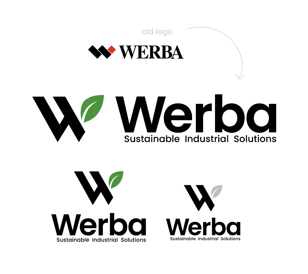
The design process started with a redesign of the existing logo. We removed the previous red color and replaced the main sharp element with a green leaf symbol, representing eco-friendliness, growth, and freshness. The logo retains its clean, geometric form and is paired with the Poppins typeface to reflect structure, precision, and modernity.
I also created a complete brand style guide that defined:
Logo usage and spacing
Color palette
Typography system
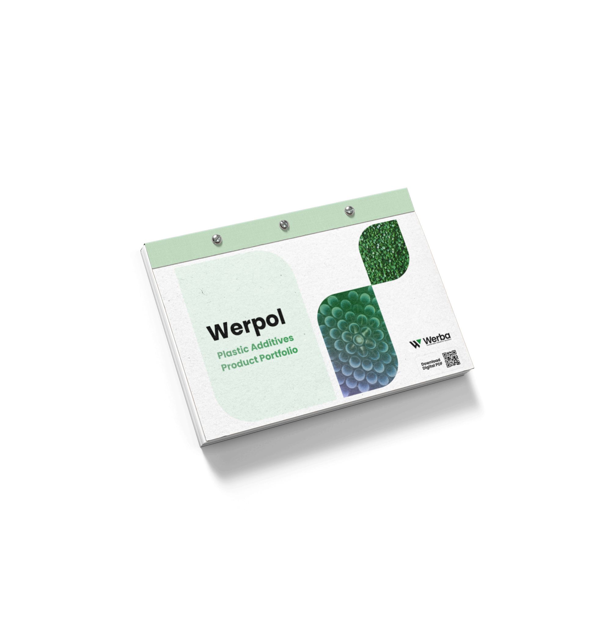
Templates for documents, transport branding, uniforms, signage, and more
UX Research & Strategy
As this was the company’s first website, I had to define the digital strategy from scratch. I conducted a series of in-depth interviews with internal stakeholders across departments including management, production, and sales to understand the core business processes and user needs.
In parallel, I analyzed over a dozen competitor websites to benchmark industry standards and identify both gaps and opportunities. This included evaluating how others structure product information, communicate certifications, and build trust through UX.
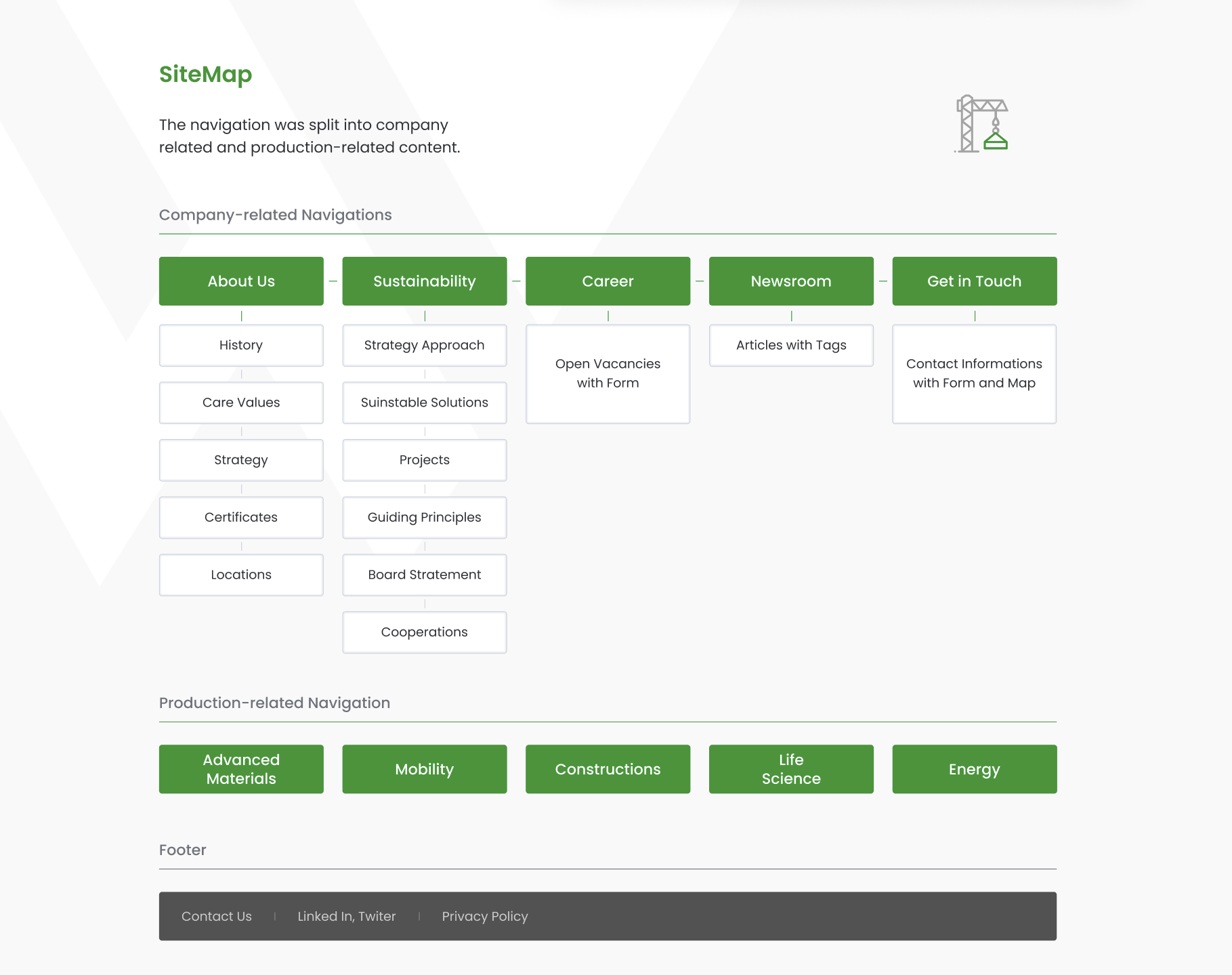
These insights helped me define the site’s information architecture from zero balancing the needs of prospective clients, partners, and job seekers.
UX/UI Design
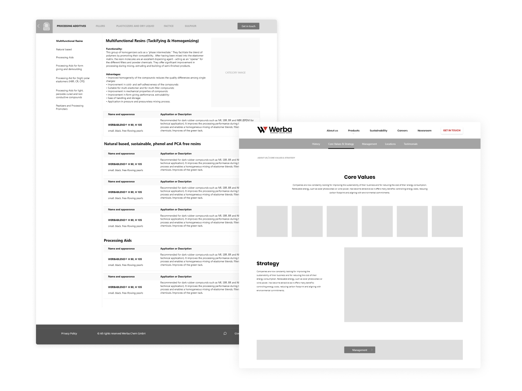
Based on the research, I developed a logical structure that separates the company profile from product-specific information. To maintain clarity and reduce user effort, I grouped secondary content into tabbed sections and kept navigation shallow.
Wireframes were designed with a mobile-first mindset, focusing on clarity, easy access to technical documents, and a seamless browsing experience.
UI design emphasized a balance between sustainability (through nature-inspired imagery and generous whitespace) and industrial precision (through grid-based layouts, consistent iconography, and technical diagrams).
The site’s product catalog is optimized for usability providing technical data in a digestible, intuitive format.
